A creative concept is cheap to admire and expensive to ship. There is a room where everyone nods at the deck, and then there is the Tuesday morning when the idea has to load on a four-year-old Android handset over hotel Wi-Fi. Most of the magic leaks out somewhere between those two moments, and it rarely leaks because the idea was bad. It leaks because nobody built a version of it early enough to learn what the idea actually costs.
Spotify’s Spreadbeats work is the cleanest counterexample available. Turning an Excel media plan into a four-minute music video only sounds like a stunt until you consider that the team had to prove native spreadsheet functions could carry sound, motion and a narrative before anyone committed budget to it. That proof was a prototype. It answered a production question, not a taste question.
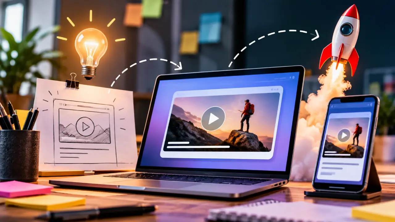
This piece is about that stage of the work, the unglamorous middle where a concept turns into something clickable. Usability, performance and the handoff to production are not downstream chores you deal with once the creative is locked. They are the constraints that decide which version of the idea survives.
What a Prototype Is Actually For
Teams get confused about prototypes because the word covers two very different objects. One is a mood piece, a clickable deck that exists to win approval in a meeting. The other is a load-bearing experiment designed to kill an assumption. Both have a place, but only the second one protects you later.
The useful question to ask before building anything is which assumption you are most afraid of. If the risk is comprehension, you need a rough thing in front of eight real users by Thursday. If the risk is technical, build the hardest interaction first and skip the visual polish entirely. A prototype that tests nothing is a very expensive drawing.
Scope follows from that. Fidelity should be uneven on purpose: beautiful where the question lives, ugly everywhere else. Teams have been known to spend two weeks matching typography on a flow whose core mechanic turned out to be impossible, and the typography did not soften the news.
Usability Shows Up Before the Polish Does
The reason to test early is not politeness, it is arithmetic. A misunderstanding caught in a rough prototype costs an afternoon. The same misunderstanding caught after production costs the campaign window, and campaign windows do not move for anybody.
Accessibility belongs in the same conversation, and it belongs there early, because retrofitting it is where budgets go to die. The Web Content Accessibility Guidelines organize their success criteria under four principles, perceivable, operable, understandable and robust, at three conformance levels. Read that as a design brief rather than a compliance checklist and it starts shaping decisions you would otherwise make badly: contrast, focus order, whether your clever gesture has a keyboard equivalent, whether the motion you love has an off switch.
Interactive campaign work gets this wrong more often than product work does, partly because it ships fast and dies young. That is backwards reasoning. A short life span is exactly why the first impression has to land, since there is no version two coming to fix it.
Performance Is Part of the Idea, Not a Tax on It
Nothing flattens an interactive concept faster than a three-second wait. Google’s Core Web Vitals put real numbers on this, and they are worth memorizing: Largest Contentful Paint within 2.5 seconds, Interaction to Next Paint at 200 milliseconds or less, Cumulative Layout Shift held under 0.1, measured at the 75th percentile of page loads across mobile and desktop. Those thresholds are not aspirations, they are the line between an experience and an abandonment.
Prototyping on a fast laptop hides all of this, which is why the prototype should run once on something slow and throttled before anyone signs off. Weight is usually the culprit, and weight is usually a creative decision in disguise: the hero video, the custom font stack, the particle effect nobody notices in the background.
Media placement has its own physics. The IAB Tech Lab’s New Ad Portfolio guidelines moved standard units away from fixed pixel sizes toward aspect ratios and size ranges, built around LEAN principles of lightweight, encrypted, AdChoices supported and non-invasive advertising. If your concept assumes a fixed canvas, the prototype is where you find that out, not the week of launch.
Making the Handoff Survivable
The gap between a working prototype and a production build is where most teams lose time, because the prototype was never meant to be inherited. Somebody rebuilds it from scratch, interpretation drifts, and the thing that tested well is not quite the thing that ships.
Shared components narrow that gap. So does being honest about which parts of the prototype are disposable and which are the real implementation. Internal tooling built with governed vibe coding can take a lot of pressure off here, letting a team assemble the dashboards, approval flows and campaign admin screens that surround a launch without those becoming engineering projects of their own. The creative build then gets the engineering attention it deserves.
Documentation sounds dull and saves weeks. One page per interaction, written while the decision is fresh: what it does, what it must never do, what was already tried and rejected. Nobody reads it in week one. Everybody reads it in week four, when the person who built the mechanic has moved to another account.
Where the Craft Actually Lives
The best interactive campaigns rarely come from the biggest idea in the room. They come from the idea that survived contact with a browser, a slow phone and a production calendar, and came out the other side still recognizable. That survival is a skill, and it is mostly practiced at the prototype stage.
So move the hard questions forward. Build the risky part first, test it on real people and bad hardware, write down what you learned, and hand over something a developer can actually read. None of that is glamorous, and none of it will ever appear in a case study.
What appears in the case study is the campaign that worked, which is the same thing, arrived at honestly.