For BLUSH, a queer bar in Almaty, Kazakhstan, maintaining a visible identity became more complicated as anti-LGBTQ+ rhetoric and legislative initiatives gained momentum. The challenge was not simply to create another Pride-themed campaign, but to find a visual language that could communicate diversity and individuality without depending on familiar symbols. Physics of Pride, created by Mega Media in affiliation with Ogilvy, approaches that challenge through something far less expected: the behaviour of light.
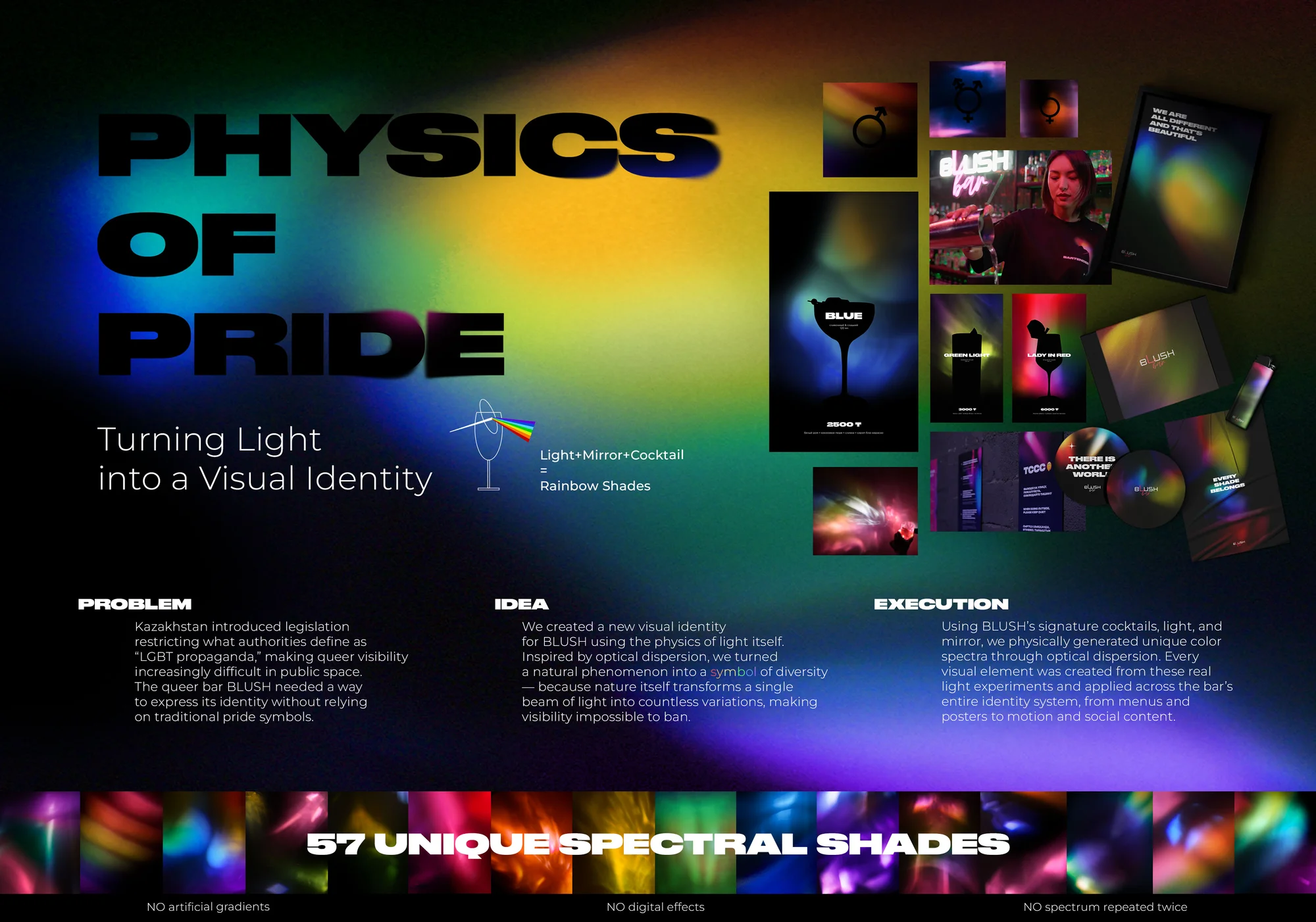
Turning Cocktails Into a Colour System
The campaign takes its starting point from optical dispersion, the natural process through which white light separates into different colours when it passes through certain materials. Instead of using the phenomenon only as a visual reference, the creative team made it the actual production method behind BLUSH’s new identity.
The process began with the bar’s signature cocktails. Using a custom setup involving light, glass, liquid and mirrors, beams of white light were passed through each drink. The cocktails altered the light in different ways, producing individual spectral compositions. Across the experiment, 57 distinct spectra were created, with each one physically generated from real light and real liquid.
That detail is important because the colours were not simply designed to look different. Their differences came from the physical characteristics of the drinks and how they interacted with the light. The resulting identity therefore has a direct connection to something that already exists inside BLUSH rather than being an external graphic treatment applied to the brand.
A Rainbow Without a Fixed Formula
Pride branding often relies on the rainbow as an immediate visual shorthand for LGBTQ+ identity. Physics of Pride keeps the connection to the spectrum, but changes the way it functions. Rather than creating one standard rainbow and repeating it across every communication, the campaign establishes a system in which every spectrum can be different.
The 57 compositions were not digitally generated gradients, and no spectrum was repeated twice. This gives BLUSH a broad visual vocabulary while keeping the identity tied to the same underlying process. A menu, poster or social post can use a different colour composition without breaking the relationship between the individual pieces.
The idea also gives the campaign its connection to individuality. Each cocktail interacts with light differently, producing its own result. In the same way, the campaign treats diversity as a collection of differences rather than something that needs to be represented by one universal image.
When the Product Creates the Brand
One of the stronger aspects of Physics of Pride is the relationship between the experiment and BLUSH’s business. The campaign could have used almost any transparent material to demonstrate optical dispersion, but using the bar’s cocktails makes the process specific to the brand.
The drinks are already part of the BLUSH experience, so turning them into the source of the visual identity creates a natural connection between what customers encounter at the bar and what they see in its communications. The cocktails do not simply appear in campaign photography. They actively contribute to the creation of the brand assets.
The resulting spectra were developed for use across menus, posters, merchandise, motion graphics and social media. That gives the campaign a practical identity system rather than a one-off visual execution. The same physical idea can continue generating different expressions across multiple formats.
The Value of Making It Physical
There is also a deliberate choice to avoid creating the entire effect digitally. Digital tools can reproduce gradients and colour combinations quickly, but Physics of Pride makes the physical experiment part of the creative proposition. Real light passes through real liquid, producing results that are tied to the materials being used.
That gives the work a sense of authenticity without requiring the campaign to make an exaggerated claim about technology or production. The visual system exists because the experiment happened. The process can be photographed, filmed and documented, while the resulting spectra can then be used as design assets.
It is a useful approach for identity work because the method itself becomes part of the brand story. BLUSH is not simply presented with a set of colours. It has a repeatable process for creating them.
A More Indirect Expression of Pride
The cultural context makes this approach particularly relevant. According to the campaign brief, public expressions of queer identity in Kazakhstan had become increasingly sensitive as anti-LGBTQ+ rhetoric and legislative initiatives gained momentum. Physics of Pride responds by communicating its central idea through a natural phenomenon rather than depending entirely on conventional Pride imagery.
The campaign does not need to explain diversity through a long statement every time the identity appears. The difference between one spectrum and another carries much of the meaning. The visual system can communicate individuality while remaining flexible enough to work across the everyday touchpoints of a bar.
That makes the campaign less dependent on a single symbolic image. The rainbow remains present, but it is constantly being reinterpreted through the physical interaction between light and liquid.
An Identity Designed to Keep Changing
The strongest part of Physics of Pride is that the campaign idea does not stop with the initial experiment. The 57 spectra provide BLUSH with a library of visual assets, while the principle behind them allows the identity to remain varied across different applications.
That flexibility is particularly useful for a hospitality brand. Menus, merchandise, posters and social content do not have to look identical to feel connected. They can use different spectral compositions while still belonging to the same visual system.
Physics of Pride takes a familiar symbol and gives it a different mechanism. Instead of treating the rainbow as a fixed representation of diversity, BLUSH builds its identity around the idea that every interaction can create something different. The result is a campaign where the creative concept, the production process and the brand application are closely connected.
Credits
Brand: BLUSH
Agency: Ogilvy Kazakhstan
Creative Director: Azatkhan Uxikbayev
Creative Grouphead: Madina Madiyarova
Creative Art Director: Sanzhar Kozzhanov
Designer: Erik Tsoy
Designer: Darya Savostyanova
Designer: Ekaterina Zakiyeva
Motion Designer: Oleg Nepomnyachshikh
Videographer: Radmir Abilyev
Executive Director: Yekaterina Belyashina
CEO, Creative Business DASM: Yuliya Tushina
Client Service Director: Mariya Kalashnikova
Group Account Director: Darya Nurlybekova
Account Manager: Igor Roginskiy
Account Manager: Evgeniya Potlova
BTL Manager: Marat Brimzharov
Additional Credits: Artem Demchenko & Denis Shilov