Finding meaningful design inspiration is not easy. Social media feeds often provide visual highlights—a polished button effect here, a striking gradient there—but rarely offer the context needed to support informed product decisions.
Experience across products of varying sizes has highlighted the value of looking beyond aesthetic galleries. The most valuable resources are those that reveal how products actually work, why certain interaction patterns succeed, and how real users navigate complete experiences. Rather than focusing solely on visual appeal, these sources provide practical insights that inform thoughtful, user-centered design decisions.
1. Page Flows
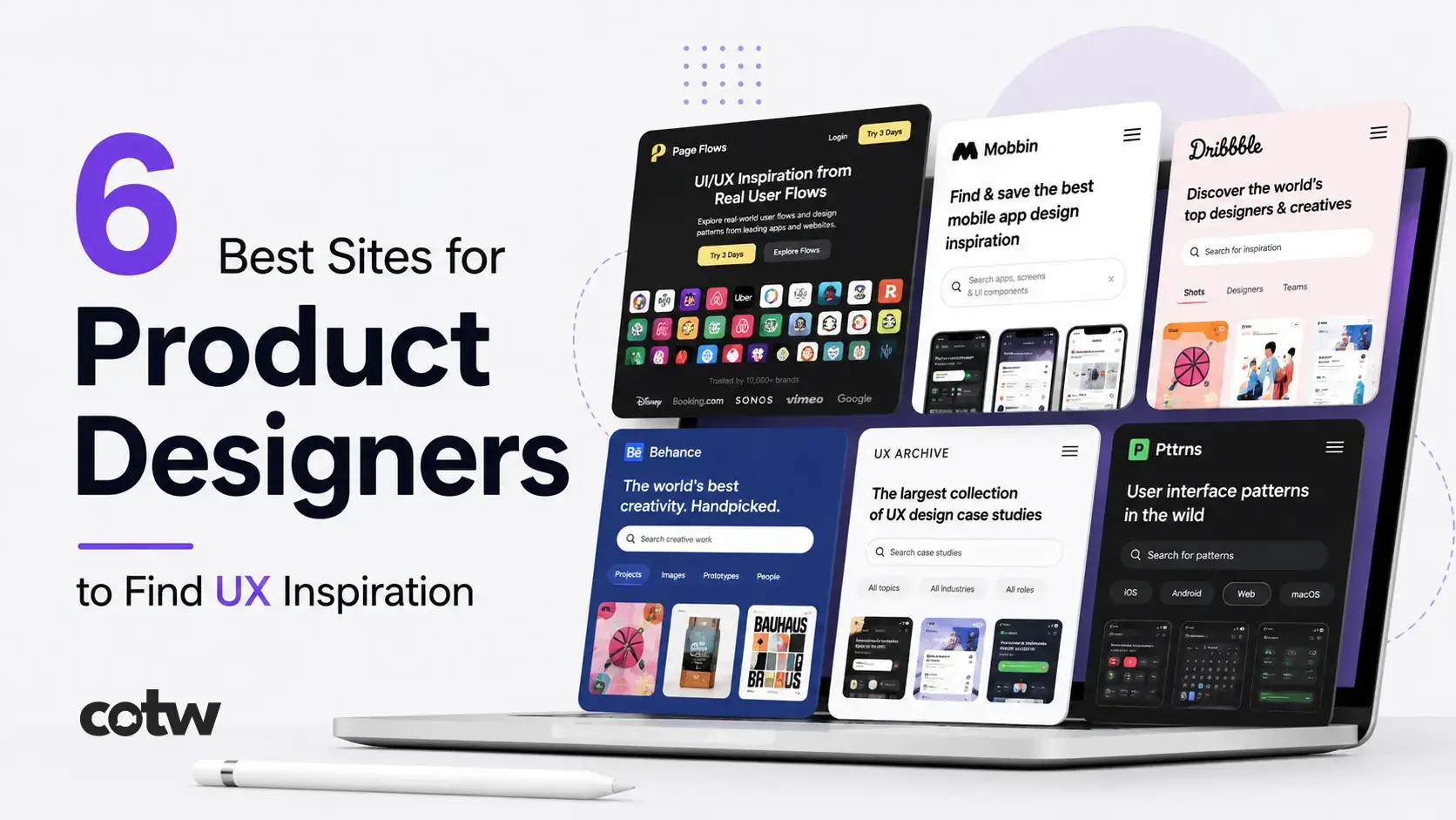
Most design platforms show you what an interface looks like. Very few show you how it behaves. That gap is precisely what makes, among the many research tools I return to consistently, Page Flows the most analytically valuable resource in this category. What separates Page Flows from similar platforms isn’t just the recordings themselves. It’s the explanatory layer built into each one. Flows are accompanied by annotations that break down the UX reasoning behind specific decisions: why a tooltip surfaces at a particular moment, how friction is reduced across a multi-step form, what visual cue guides users toward their next action.
The filtering system adds serious practical utility. Search by platform (iOS, Android, or web), industry, company, or specific interaction type. Premium access unlocks the complete library, and for designers working through discovery or early feature planning, the investment earns its place quickly.
2. Mobbin
Mobbin has become one of my most-used research tools for mobile product work. It captures actual screenshots from live iOS and Android applications, organized by app, screen type, and UI pattern. What distinguishes it from other mobile galleries is that it documents real production interfaces: not redesign concepts, not student projects, but shipped screens exactly as users encounter them.
The search and filtering capability is where Mobbin earns its standing. You can pull up onboarding screens across fintech products, compare checkout flows within e-commerce apps, or explore how different categories handle empty states and error messaging. For any designer focused on mobile, the time saved on pattern research alone makes it genuinely indispensable.
3. Dribbble
Dribbble needs little introduction, but how designers use it effectively has shifted over time. I no longer reach for it when making UX decisions; too much of the content prioritizes visual impact over functional soundness. Where it genuinely excels is surfacing where aesthetic sensibilities are heading: evolving typographic approaches, emerging color systems, layout experiments, and component-level visual exploration.
The value lies in using it with intent. Let Dribbble sharpen your visual vocabulary without letting it override structural or interaction thinking. It’s a strong tool for establishing design direction; it’s a weak one for figuring out how user flows should actually be built.
4. Behance
Behance occupies a different niche from most resources on this list. Instead of screen galleries, it regularly hosts complete design case studies – documented from early research and wireframes through to final deliverables, with the reasoning behind key decisions visible throughout. That process transparency is something isolated screenshot libraries fundamentally cannot replicate.
The challenge is inconsistent quality. Filtering through student portfolio submissions to find genuinely rigorous case studies takes real effort. When you find the right ones, though, they offer something the other platforms here simply can’t: insight into how experienced designers navigate complex, ambiguous problems, not just what the polished outputs eventually looked like.
5. UX Archive
UX Archive organizes mobile app flows around the specific task being performed: logging in, completing a purchase, editing a profile, recovering an account. Its structure is deliberately minimal, which makes it surprisingly fast to navigate. When I’m beginning work on a particular feature, this is often my first stop: a direct way to see how established products have approached the same interaction challenge before I start developing my own direction.
It’s free to use, and while it lacks the annotation depth, its task-based organization makes it a solid reference whenever I need a quick landscape view of how a specific scenario is typically handled.
6. Pttrns
Pttrns is a well-established mobile pattern library built around UI function rather than visual style: search interactions, navigation structures, onboarding flows, form design, and more. Its organizational logic is designed for a specific kind of research question:
not “what should this look like?” but “how do other mobile products handle this interaction?”
When used alongside a more comprehensive platform, it helps you quickly assess whether your proposed solution follows established mobile conventions or intentionally diverges from them in ways that warrant deliberate justification.
Conclusion
No single platform here covers every dimension of UX research, and relying on just one will leave gaps in your thinking. What I’ve found most effective is treating these resources as complementary: reach for Page Flows or UX Archive when flow-level understanding is the priority, use Mobbin or Pttrns for specific pattern analysis, and bring in Dribbble or Screenlane when visual direction needs grounding. Used together, they cover the full range of questions that serious product design demands.