You have about three seconds to convince someone to care about your event. That is all a person gives your poster before they scroll past or walk by. Content with strong visuals gets 94% more views than plain text (source), which means your event poster design is doing most of the sales work before your audience ever reads a single word.
A great poster does not just look nice. It moves someone from “meh” to “I need a ticket.” A boring one costs you real money in unsold seats.
Key Takeaways
- You have three seconds to grab attention, so one strong visual beats a busy layout.
- The event name should be the biggest thing on the poster, not the sponsor logos.
- Use color to trigger emotion and a QR code to shorten the path from poster to purchase.
- Study great campaigns, borrow the principle, and use an AI poster generator to speed up production.
Why Your Event Poster Design Decides Your Ticket Sales
Think about the last event you bought a ticket for. What made you stop and look? It was probably one image, one bold headline, or one strange creative choice that felt different from everything around it.
That is what a good poster does. It interrupts. It makes a promise. It tells you in one glance whether the event is for you.
If your advertisement poster design tries to say ten things at once, it says nothing. People scan for one hook. If they cannot find it, they move on.
Event Poster Design Ideas That Sell Tickets
Use these creative poster design ideas as a checklist for your next event.
1. Lead With One Bold Hero Visual
Pick one image and let it own the poster. A face, a product, a symbol, or an abstract shape. Anything that makes someone stop scrolling.
Most people fill every corner. Give your hero visual room to breathe instead. White space is what makes your main image feel important.
2. Make the Event Name the Biggest Thing on the Poster
If someone walks past your poster and cannot read the event name from a few feet away, you already lost them.
Use a big, bold, easy-to-read font. Sans-serifs like Futura or Helvetica stay clear at any size. Save script fonts for the tagline, not the headline.
3. Use Color to Trigger the Right Emotion
Color is not decoration. It is a shortcut to how you want people to feel.
- Red for excitement, urgency, or passion. Good for concerts, sports, and sales.
- Blue for trust and calm. Good for conferences, workshops, and wellness events.
- Yellow for energy and fun. Good for festivals, kids’ events, and community fairs.
- Black and gold for premium and exclusive. Good for galas and launches.
Pick one main color and one accent. That is it. Two colors done well beat six colors fighting each other.
4. Cut the Info Down to What People Actually Need
Every event poster needs five things. Name, date, time, place, and how to buy a ticket. That is your core.
Everything else sponsor lists, the full lineup, and terms and conditions, belongs on your landing page. The poster’s job is to make people want the ticket. The website sells it.
5. Add a Scan-and-Buy CTA
A QR code turns your poster into a checkout page. Someone sees it, scans it, and lands on the ticket link. No searching. No typing.
Place the QR code in the bottom corner with three words next to it. “Scan to book.” That short line converts far better than a URL nobody wants to type.
6. Try Minimalism When Everyone Else Is Loud
If every other poster in the space is busy, be quiet. A near-empty poster with one striking image and three lines of text can outperform a design packed with details. The Randolph Engineering “See it All” campaign shows how minimal, almost text-free posters can carry a full brand story. The same idea drives some of the best minimal movie poster art you have ever seen. One shape, one color, one perfect reference.
7. Make Your Poster Interactive or Unexpected
The posters people talk about break the format. Carlsberg’s beer-tap poster in London was a real, working tap that poured cold beer for passersby. The poster became the experience.
You do not need a beer tap. A tear-off tab with a discount code works. So does a coin-slot poster like TD Bank’s kids’ savings campaign. Anything that makes someone touch the poster makes them remember the event.
8. Use an AI Poster Generator to Move Faster
Great design used to mean a designer, a week of drafts, and a big budget. Not anymore.
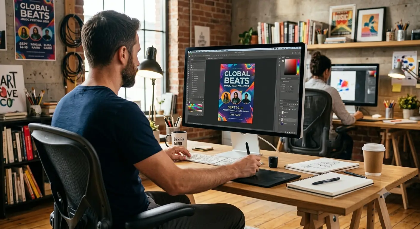
You can now use a free AI poster generator to turn a short prompt into a polished poster in minutes. Type in your event name, the vibe, and the audience. Pick a layout, tweak the text, and download. It is ideal when you need multiple versions for A/B testing or last-minute changes.
Use the tool for speed. Use the ideas above for the strategy. That combination lets one person do what used to need a full design team.
Pro Tip
Before you print anything, shrink your poster design to a thumbnail on your phone screen. If you cannot tell what the event is and where to buy the ticket from that tiny version, your poster is too busy. Fix it before you spend a rupee on printing.
How to Test Your Event Poster Before You Print It
A quick test saves money and wasted seats.
- The three-second test. Show it to a friend for three seconds, then hide it. Ask what the event is and where. If they cannot answer, your hierarchy is off.
- The squint test. Squint from a few feet away. The most important element should still be visible. If everything blurs, your contrast is weak.
- The stranger test. Post it in a group chat with people outside your team. Ask, “Would you buy a ticket?” Their gut answer tells you more than any focus group.
Wrapping Up
The best event poster design is not the prettiest one. It is the one that makes a stranger stop, understand the event in three seconds, and reach for their phone to buy a ticket.
Start with one bold visual. Make the event name huge. Cut the clutter. Add a QR code. Then use an AI poster generator to iterate faster than your competitors.
FAQs
1. What size should an event poster be?
A4 works for flyers. A3 is standard for indoor walls. For outdoor and street use, go with A2 or A1. For social media, design a 1080 x 1350 pixel version so it fills the feed without cropping.
2. How many words should a poster have?
Keep the total copy under 30 words. Event name, date, place, one line of value, and a call to action. Any more and the poster starts to feel like a document. The goal is one glance, not a full read.
3. What is the best free tool for event poster design?
For non-designer-friendly poster design ideas, an AI poster generator saves the most time because it handles layout and typography for you. Canva gives more manual control. Figma works best if you already know design tools.